George Hardie, graphic designer, illustrator and educator

In 2014, internationally acclaimed graphic designer, illustrator and educator Professor George Hardie retired from his work teaching on Brighton’s Illustration BA(Hons) and MA Sequential Design and Illustration BA(Hons) courses. As he did, be became a Professor Emeritus, having contributed to education in illustration and graphic design at Brighton for thirty years. At that stage he had also enjoyed a 51-year-long career as a freelance illustrator with successes that included Royal Mail and La Poste stamp designs, a Mastership of the Art Workers Guild, Royal Designer for Industry, graphic solutions for a range of industry clients as well as his own books.
Hardie’s aspiration ‘to notice things and get things noticed’ covered his work as a creative and a teacher. In his teaching role at the University of Brighton he said he learnt only to set problems to which he doesn’t know the answer, while his experience of teaching abroad made him relish working in an educational system that is based on the premise that the teacher is always wrong.
George Hardie’s early illustration work
George Hardie’s early graphic work is instantly recognisable to fans of 70s rock, having produced, with the design group Hipgnosis, the artwork for Led Zeppelin’s debut album (1969) Pink Floyd’s Dark Side of the Moon (1973) and Wish You Were Here (1975), 10cc’s How Dare You (1976), Black Sabbath’s Technical Ecstasy (1976) and Led Zeppelin’s Presence (1976).
George Hardie was born in 1944 and trained at St Martin’s and the Royal College of Art (RCA). His professorship of Graphic Design came in 1990, he was elected to the Alliance Graphique Internationale in 1994, later becoming its International Secretary and in 2005 was elected a Royal Designer for Industry.

George Hardie, Magic Set, Royal Mail.
He gained widespread notice through work for the Royal Mail, winning a D&AD silver award for his Millennium stamp, and designed the Channel Tunnel stamps for the Royal Mail and La Poste (1994) and the illustrations for the Magic stamps (2007). His work has been exhibited extensively: with one-person retrospectives at Brighton, Barcelona and most recently in Ljublijana (2008) and exhibitions of his books at the Pentagram Gallery and in Nagoya.
George uses an inventive combination of mixed-media and collage techniques, experimenting with perspective and geometry, and is particularly respected for his ability to solve visual problems through careful observation and crafting of graphic solutions. His adaptability and success with both commissioned and non-commissioned work has also been remarked upon. His Manual (2005) is a limited edition work about hands, which acts as a handbook of batch production and ‘hand-made’ techniques.
“Each project entangles the illustrator in a complex web of rules: rules of function which might come from a client; rules of reproduction; rules imposed by the audience and context; rules governed by the deadline. In addition, there are rules that are more personal… Although perhaps not all considered consciously and not often evident to the audience, these rules must be coherently and consistently deployed within a picture and particularly in a set of designs of pictures. These rules, not whimsy, make a style.”
‘Toeing the Line’, George Hardie, in Mobility of the Line, Ivana Wingham, ed. 2013.
Who did the cover for Dark Side of the Moon? George Hardie’s owning up to a bit of a history

Cover for Pink Floyd Dark Side of the Moon. Produced by George Hardie for Hipgnosis design studio
George Hardie now recognises that the popularity of the early works that he produced for the music industry. It has given him what he calls “a bit of a history”. Ever modest, he says that he realised he’d underestimated the importance of these works when he was recently asked to represent the 1970s on a ‘Sex, Drugs and Rock’n’Roll’ panel for D&AD, the global association for Creative Advertising & Design, from whom he had been awarded four 1970s D&AD silver awards with Hipgnosis.
He continues: “I started enjoying making the point that for the first Led Zeppelin cover, the image was famous, not for my creativity but because I dot-stippled an iconic photograph to avoid copyright and because my client later became world famous. It was not even the best phallic image I made in my second year at the RCA.
“Once admitted I passed this truth on to professional audiences in six Australian cities and an audience of over two thousand students and practitioners at AGIdeas in Melbourne. As the Australian Graphic Design Association 2006 international speaker I was described as an acclaimed illustrator, designer and teacher. Only a few months later Parsons, the New School of Design in New York suggested promoting me as a ‘Veteran British Illustrator’. We settled for ‘Legendary British Conceptual Illustrator’.
“At the age of 60 I realised I could no longer ignore the part of my youth wasted designing record sleeves. I included my sticker design for Pink Floyd’s Wish You Were Here in press releases for exhibitions.”
George Hardie offered the following list to the University of Brighton in 2009. He calls it – Owning up to having a bit of a history. The 70s revisited in the early Twenty-First Century:
2003
- In Designed by Peter Saville (2003) Saville included Bush Hollyhead and George Hardie amongst his graphic heroes in 1975
- I was invited to represent the 70s on a panel for D&AD. ‘Sex, Drugs and Rock’n’Roll’ to an audience of eight hundred professionals at the Logan Hall, London. This light hearted anecdotal event made me realise that I ‘had a bit of a history’ and that I had perhaps underestimated its importance. (In spite of four 70s D&AD silver awards shared with Hipgnosis).
- Instituto Universitario de Architettura, Venice insisted that I include music graphics in my lecture
- For another ‘bit of a history’ read about NTA Studios (our studio in the 70s and 80s) in Eye 58 (2005), Varoom 04 (2007) – Ian Wright interview. Article on AOI covers
- Open Manifesto 3 (2007) – George Hardie interview
2004
- At 60 I realised I could no longer ignore the part of my youth wasted designing record sleeves
- I included my sticker for Pink Floyd, Wish You Were Here (hand related) in press releases for the exhibitions of Manual, and my stay as a visiting professor at Nagoya University of Arts. They politely said this image might remind people who I was
- I used it thereafter as an example of my ‘going amateur’ projects; comparing the audience of some fifteen million (sticker) with the ninety nine possible Manual owners.
2005
- Ganzfeld 4 includes an article about designing the cover for Led Zeppelin, Presence. I was interviewed and the piece is larded with my comments and recollections. Ganzfeld 4. ‘Art History. Under Hipgnosis’, Oliver Broudy. 14 pages illustrated
- Finn Nygaard exhibited my ‘Pink Floyd at Knebworth’ poster in Fynn Nygaard and Friends. Danske Kunstindustrimuseum, Copehagen. (Catalogue)
2006
- I started enjoying making the point that the first Led Zeppelin cover (1969), the image was famous not for my creativity but because I dot-stippled an iconic photograph to avoid copyright and because my client later became world famous. It was not even the best phallic image I made in my second year at the RCA
- Once admitted I passed this truth on to professional audiences in six Australian cities and an audience of over two thousand students and practitioners at AGIdeas in Melbourne. As the Australian Graphic Design Association 2006 International speaker I was described as an acclaimed illustrator, designer and teacher.
- Only a few months later Parsons the New School of Design, New York suggested promoting me as a ‘Veteran British Illustrator’. We settled for ‘Legendary British Conceptual Illustrator’. At the Parsons symposium I spoke shortly after a keynote speech, Sarah Boxer on George Herriman, and decided to admit for the first time that my Pink Floyd Dark Side of the Moon stickers owed a huge debt to Krazy Kat
2007
- Invited to participate in National Life Stories. The British Library Sound Archive
- Typical of many such publications, large and small, over the years is The Observer Book of Rock and Pop (October) which places Dark Side of the Moon sixth in Ten of the Best Album Covers (credited Hipgnosis and Hardie)
The retrospective at the University of Brighton Gallery for George Hardie in 2016 showed a full appreciation of George Hardie’s work. But there was no doubt that a percentage of visitors were particularly excited to see the original sketches and inspirations for those famous album covers, designed by the young Hardie and his Hipgnosis colleagues when fresh from art college.
George Hardie’s style as an illustrator
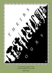
George Hardie, ‘You should be suspicious when you see a straight line on a map.’
In 2006, Rita Siow of the Australian Graphic Design Association characterised Hardie’s creative approach:
“Hardie does all the things that a professional illustrator should: he solves problems; he draws with exactitude; he makes images that delight because they are challenging. Hardie’s consciously self-depreciating titles nod to a career spent working mostly around, as he says, ‘wanting to do good work. I never saw it as a career thing. But then, I was very lucky – things just fell in my lap’. But in image after image he achieves something beyond just professionalism: he doesn’t just solve a problem or create a compelling image, rather he draws visual ideas that force viewers to ‘wear a new pair of spectacles’ and open up to a new visual experience of even the most familiar terrain…”
One of George Hardie’s 2012 projects was the creation of Metaphorical Measurements for a British Olympics booklet, a visual clarification of measurements involved in 30 Olympic and Paralympic sports.
His work charmed journalist and Olympic spectator Luke Winn: “When I took my seat near the finish line at Olympic Stadium, and later watched Bolt (and his two Jamaican countrymen, Yohan Blake and Warren Weir) roar around the turn in my direction, I had oddball British speed equivalents on the brain. The reason was George Hardie [and a] small booklet titled Metaphorical Measurements for a British Olympics.
“It was a bunch of pocket-size whimsy, created by someone capable of viewing sports through an abnormal lens. For example, the boxing page suggested recalibrating the Olympic weight classes to match British Wild Animals, meaning some fighters would be competing for the title of Otterweight Gold Medalist” Luke Winn at the 2012 Olympics writing for Sports Illustrated
This is typical of the charm of George Hardie’s work, the seemingly effortless humour which belies the painstaking craft and the deep understanding he has of its rules. So, what first hits you when you see George Hardie’s work on the walls of a gallery or in a book? Often it’s the comic creativity – you laugh, you think “that’s clever” – but, not far behind is that “wow” of the clear artistic genius. The layperson can’t help but enjoy the works, as do the many gallery visitors at Brighton. The understanding of his excellence is however what has made him the major respected figure in his profession.
What did acclaimed illustrator George Hardie do for a living?
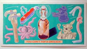
George Hardie, You can’t top a Grolsch
A much-quoted article by Daniel Nadel for Eye Magazine, Winter 2005, opens with a characteristic story from a dinner party of such professionals: “At a dinner party some years ago a fellow guest asked George Hardie what he did for a living. The acclaimed English illustrator, professor of graphic design, NTA Studios co-founder, and the creator of iconic rock ’n’ roll images, including the cover of Pink Floyd’s Dark Side of the Moon, replied, ‘I’m an illustrator, designer and teacher.’ Unsatisfied, his tablemate pressed, ‘no, what do you really do?’ Hardie is an unflaggingly polite, but most of all, modest, English gentleman. So, after a lengthy pause he responded: ‘I notice things and I get things noticed,’ a fairly unassuming assessment of a four-decade-old career in which he, semi-ironically claims, to have been a ‘jobbing illustrator’.
George is fondly remembered as a teacher, too. He recalled some of his experiences of teaching at Brighton during the major retrospective on Illustration at Brighton in 2012:
“Brighton has been in the forefront of educating illustrators for many years. When I began teaching it was one of only 18 colleges in the United Kingdom that was first chosen to run a graphic design course, which included illustration, at degree-equivalent level. When the new Diploma was being offered at Brighton the illustration course soon had the largest number of illustration applicants in the country. As well as its location, and the nature of the course, the attraction to apply was the simple fact that it was taught by active practitioners in the field.
“The BA Honours course in Illustration has held on to its reputation because it has always held the balance between giving the students a practical professional education together with one that allows the individual to flourish. The MA Sequential Design/Illustration course, which began in 1989, has been my greatest delight. Working as part of a small team was a real pleasure and education for me. The central concern of the course has been the sequencing of images. The founding principle of the course has been ‘the understanding that in any form of graphic seriality we cannot read a single message without its meaning being modified by our perception of the context in which it is placed; by its relationship to those messages that precede it and by those that follow it’. This course has catered for a wide variety of disciplines including illustrators.

George Hardie, English Gardening
“Teaching a creative subject like illustration is complex and it is one thing informing students about straightforward facts and technical matters but it is something entirely different when it comes to guiding their creative and imaginative instincts.
“Thinking up original ideas, establishing the content, working out ways of drawing, and constructing or composing images, are all aspects of illustration that have to be considered. Tutors need to take risks in the way they approach their teaching. What is appropriate for one student may be entirely inappropriate for another. Devising courses is a matter of planning what all students must be aware of and balancing this with how their individual development is catered for; the first so that they are fully capable of harnessing and adapting their skills to the profession, and the second so that they are able to flourish and develop uniquely.
“It is important to build up a relationship with students, one in which there is mutual trust and understanding. Timing is of the essence – recognising promising directions in students’ work at precisely the right moment, by noticing the special quality of a drawing or painting that may be hidden away in a sketchbook, for instance, and encouraging them to develop something on those lines and go all out for it. Being helpfully critical about their work is essential so that they recognise the constructive value of what tutors may have to say, and so that they can move forward, rather than being hurt by it. Getting them to be critical about their own work is important so that they can discuss it openly and frankly with their tutors and with their fellow students.
“It is important to establish the right balance as to how much tutors advise students and when to hold back. Students often need to be left to work things out things for themselves without depending too much on tutorial prompting. Suffocation can be just as bad as neglect. We need to guide students so that they can develop a sense of personal initiative, to gain the confidence to work independently and consistently. “At Brighton we have always tried to avoid a ‘house-style’. There is nothing worse than drearily cloning students into a common way of working. The course has always tried to avoid the dull convention of ephemeral trendiness.
“Illustrators have to discover their own market quickly when they go into the outside work. It is not easy. They have to be adaptable if they want to earn a living as an illustrator. They have to balance their own ideals with those that may prevail in the commercial world. They soon have to grasp the essence of a client’s brief with a greater degree of compromise that they may have done under their tutelage as a student.”
-

- George Hardie Olympic Measurements (2012)
-

- George Hardie, Olympic Measurements (2012)
-

- George Hardie, Olympic Measurements.
George Hardie’s development of illustration at Brighton
On his retirement, George Hardie reflected, “The Polytechnic and then the University of Brighton has provided an academic base for all my activities for the last 28 years. This has enabled me to grow from a graphic designer/illustrator to a position where I occasionally get described as a designer/illustrator/educator. The community has provided me with debate on a weekly basis (an absolute essential for a sole trader tied to a desk, and since 1982, working alone outside London). It has enabled me to undertake experimental projects, self-publish, write, teach abroad, teach across disciplines, curate and has acted as a base for all sorts of activities and a platform for launching the results. I hope in describing the advantages gained I have hinted at what I’ve attempted to put back in the way of teaching and organising.
“The increased insistence on research was at first difficult to swallow. Most of my generation of teachers were employed because of their practical, professional work. In reality once the switch was made, and we had some great individual help with this, the switch from practice to research, perhaps from ‘things we’d made’ to what we were exploring, ‘why we made them’ became very liberating. I finally began to understand what I was really doing with my life and was better able to pass the recipe on to students. Put crudely, the change from ‘I might have had a hand in anything that ends up printed’ to ‘I notice things, and I get things noticed’. Neither great examples of professing one’s discipline but the latter much more personally useful. By understanding this, illustration becomes an area for exploration and experiment; a subject rather than a profession.
“Small delights have been: nearly always having women bosses: still having a type workshop and a book bindery; the enthusiasm of technicians taking part in projects; the availability of international experts amongst colleagues; colleagiate attitudes from all; the generosity of visiting lecturers; alumni/leavers as innovators. Teaching illustration at Brighton has been a real passport to developing a rewarding practice.”
The last word here comes from Daniel Nadel on George’s illustration work:
“Seeing and understanding this kind of illustration is immediately followed by two distinct actions: noticing and gathering. First, you notice that, indeed, a trowel does resemble a tree, perhaps even a tree it helped plant. Once you notice that, you begin to see what else resembles a tree. And this game continues to varying degrees of grouping, noticing and seeing until you’ve assembled collections of like things in your mind, collections that Hardie himself, perhaps, has cultivated. Suddenly Hardie has you wearing his spectacles.”
Daniel Nadal, ‘The rules of the game’. First published in Eye no. 58 vol. 15 Winter 2005.