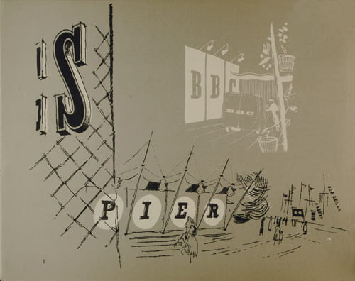
‘A Specimen of Display Letters Designed for the Festival of Britain 1951’, Typography Panel of the Festival of Britain, 1951. University of Brighton Design Archives.
The Southbank Centre celebrates the 60th anniversary of the Festival of Britain with a four-month Festival of British culture and creativity. This includes an exhibition about the history of the Festival of Britain which opens this week. Publications and photographs from the Design Archives form a section of the exhibition that considers lettering and the Festival. Selected by Catherine Moriarty, the objects and the text that comprise the display are reproduced below.

‘A Specimen of Display Letters Designed for the Festival of Britain 1951’, Typography Panel of the Festival of Britain, 1951. University of Brighton Design Archives.
A group of experts known as the Typographic Panel produced guidelines for designers and architects responsible for the lettering on Festival buildings. Their aim was to ensure a consistent approach to the problem of display lettering that was both adaptable and ‘British in feeling’. Inspired by early 19th century display types, the panel recommend a family of alphabets that comprised Egyptian and Roman letter-forms in italic, condensed and extended versions. They wished to provide ‘plenty of scope for inventiveness’ but to ensure cohesion across the site. Applied to different kinds of surface, in different materials and on hugely different scales, the lettering of the Festival retains a period feel that is as distinctive as the Skylon and the Antelope chair.
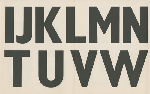
‘The Use of
Standardized lettering in Street and Transport Signs’. Festival of Britain 1951. The recommended alphabet for directional signposting was Gill Bond Condensed.
Two audacious interpretations include the titling of the Lion and the Unicorn Pavilion by John Brinkley and Jack Howe’s litterbin with its isolated ‘L’ floating happily above a perforated surface. This shift from the strictures of high modernist sans serif lettering to a more relaxed, celebratory and very English style had been heralded in the pages of the Architectural Review in the pre-war years. This turn to a jauntier and more decorative visual language was part of a wider move towards the appreciation of vernacular arts and the peculiarities of English culture, in both craft and industrial forms. This is not to say that those designers with an international training and modernist credentials of the first order were unable to bend to the Festival mood. Certainly the lettering adopted for the interior displays varied in the way the Typographic Panel might not have anticipated. F H K Herrion’s lettering above the live poultry exhibits in the Country Pavilion comprised a display case faced with egg packing trays and the words “The Modern Hen” picked out in eggs.
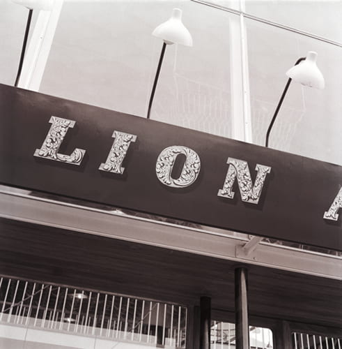
Black and white photographic prints of the lettering on the Lion and Unicorn Pavilion by John Brinkley. Catalogue number: DCA-30-2-626.5.
Paul Rennie’s article ‘Fat Faces All Around: Lettering and the Festival’ in Elain Harwood and Alan Powers eds. Twentieth Century Architecture: Festival of Britain, no 5, (2001), pp.109-116, is essential reading on this topic.
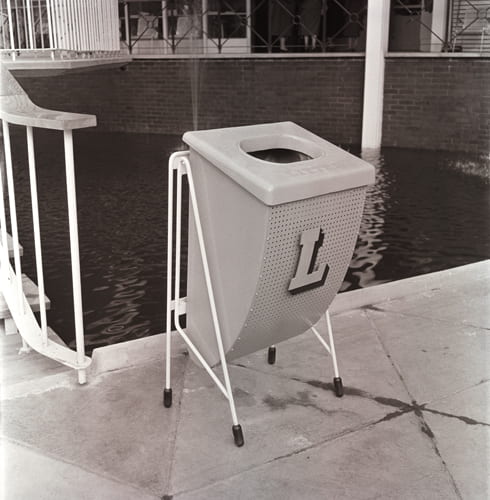
One of the outdoor litter bins designed by Jack Howe for the South Bank exhibition site. Catalogue number: DCA-30-2-626.17.
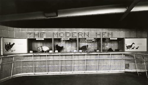
Black and white print showing the lettering designed by F H K Henrion above the live poultry exhibits in the Country Pavilion. Catalogue number: DCA-30-1-FOB-CO-1.

Leave a Reply