Graphic Design BA(Hons) student Nadeen Mashini takes the prize.
12 Dec 2013

The annual PrintWeek competition The Power of Print has been won by University of Brighton Faculty of Art Graphic Design BA(Hons) student Nadeen Mashini.
Nadeen made a series of origami cranes from survey results she carried out asking what people what they still loved and valued about the printed word.
Words such as ‘focus’, ‘hold’, ‘physical’ and ‘history’ feature as expressions of how people positively respond to the printed word.
Now in its third year, the competition is run in conjunction with the Faculty of Arts graphic design course and industry magazine PrintWeek.
Nadeen surveyed young and old, sizing the cranes according to respondents’ ages. And the 30 second-year students competing for the prestigious accolade of being featured on our cover (and for the iPad prize of course), had similarly positive things to say about their love of print, of those in their 20s still being very much ‘generation print’.
“I really like collecting well made bits and pieces, I just love boxes full of cut-outs from magazines. I love the physicality of them,” said Chloe Ashborn, during the PrintWeek roundtable discussion held this year as a chance for students to hear from printers about innovative print campaigns and opportunities designing for print.
“I really hope and feel that print’s going to always be around in a big way,” said this year’s winner Nadeen. “I think print advertising might diminish slightly as moving images take over, but I think most people still prefer print to digital for most things. With print you can always go back to it whereas with digital it just vanishes. An online issue of a magazine might not be there a few months later. There’s an illustration magazine I particularly love called Hi-Fructose. I like buying that and hardback books because you feel like you own the art.”
On the comments collected through her survey, Nadeen says: “Most said they liked the idea that you own something – that you have something of your own and you can touch it and flick through pages. Most said they liked the feel of paper.”
Nadeen reports that she had the idea for origami birds as soon as PrintWeek briefed the students on their task: to design a cover that conveyed what print means to people today.
“I just thought it was perfect for showing how print could be 3D – you can touch it and feel it and see the perspective of it,” she says. “I was really pleased with the final result, the way they move in the air. And it was really nice making the origami, it was so satisfying to handle the paper.”
Not that making 43 paper birds by hand wasn’t challenging. “I learnt how to make them from YouTube. It took me about three days to get the birds done and two days to hang them,” says Nadeen. “After making a few birds I got a bit faster, but then hanging them without tangling them was the harder bit.”
But the judges unanimously decided this effort was well worth it. Nadeen had some tough competition from her peers, with four runners-up prizes awarded. But none could quite compete with such a striking image, and one which communicated the personal, tactile and versatile nature of print in such an immediate way.

Chloe Ashborn
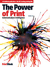
Chloe created this explosive design by firing food colouring from a turkey baster in her garden. “I made about 20 different versions. It was hard to plan around where the masthead was going to be because I couldn’t really control where the ink was going. I had to edit it on the computer,” she says. “I had to use a straw to blow it in different directions. My cat wasn’t very helpful – he got covered in ink and ran all through the house!”
She adds: “I wanted to reconnect people with how exciting and experimental the process of print still is. I feel sure print will always be around, I love collecting printed ephemera and books.”

Oskar Key-Westin
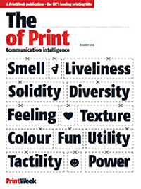
By playfully tweaking the Power of Print masthead, Oskar reminds us of how it is print’s diverse qualities which make it so powerful.
“The cover’s designed to show that there are many things that are nice about print,” says Key-Westin. “I was thinking the reader would cut out the words in their head and decide which one they most identified with. The design’s got a narrative – you end with power. That sums it up. This is the power: everything. My favourite thing about print is the smell. It’s the first thing I do when I get a magazine.”

Kate Jeffries
Kate’s first idea was to stencil her quote onto the fore edge of a book so that held one way the first half was visible, and the other, the second half. Unfortunately the final cover design wasn’t as striking and interesting as the process behind it, so Kate went back to the drawing board to produce an image which nicely conveyed the decorative appeal of books, while utilising her strong quote.
Kate said: "The quote really stuck with me, because of the way when you read something on the internet it doesn’t stick. There’s other stuff going on on the screen and your attention’s grabbed elsewhere,” she says. “I see print staying strong for text books, novels and magazines. I don’t think printed self publishing will go anywhere any time soon either.”

Will Lyall
The idea behind this design was, like Nadeen’s winning entry, to reconnect people with how satisfying building something out of paper or holding print can be. It also reminds you of the interconnectedness of digital communications, design tools and print.
“I always knew I wanted an element of it that was about using your hands,” says Will. “This design starts on a computer and you print it out and make it back into a computer, so it was about that close relationship between the two mediums.”
