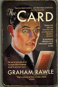
Author, collage artist and developer of the Guardian Lost Consonants, Graham Rawle gives an insight into his working methods.
29 Apr 2014
Lecturer and researcher Graham Rawle is one of contemporary literature's most innovative design practitioners. His work includes the Lost Consonants series for the Guardian and a set of witty, highly-crafted novels that play with the look and feel of the page using typography, collage and experimental layouts. His successes include Diary of An Amateur Photographer, Woman's World and The Card while his latest novel, Overland is due to be published shortly. Here he talks about his working methods:
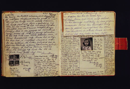
Few people have read The Diary of Anne Frank in its original form, but when you see it – the actual pages, the shape, style, position of her writing, the choices she makes about including the photos of herself – you understand so much more about her personality, which makes her story all the more poignant. The book is generally read in traditional book form for reasons of readability, or through the need to translate into other languages. But surely something is lost in the translation from the original diary to the printed text.
Prose fiction nearly always conforms to the conventions of book publishing and printing. The page from one book looks very like another. The graphic surface of the page is essentially abstract: printed words that need to be decoded through the process of reading for us to understand the author’s message and to learn about the characters in the story. That’s how it works, and has worked for hundreds of years.
The proportion of books that challenge or explore these conventions is still relatively small and there is a strong tendency to regard such books as unreadable, difficult or gimmicky. With a background as a visual artist, it seems to me that in creating a work of fiction, all kinds of extra information can be carried on the page, creating additional, sometimes unconscious, narrative layers – a kind of visual subtext.
When I wrote Diary of an Amateur Photographer, my idea was to create a book that looked and felt like the original journal of the protagonist, so the entire book is created by hand as he would have done it. Gathered ‘evidence’ is stuck to the page and the words are manually typed onto old scraps of paper.
I wanted to provide another layer whereby the reader learns more about Michael’s character and psychological state – sensing his physical presence on the page in the way his typewriter keys strike the paper, the choices he makes in the delivery of his story and in the increasingly erratic page layout as his investigation spirals out of control. Interestingly, physically assembling the pages in this way also helped me as a writer to get inside his character.
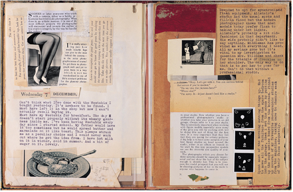
The story also carries plot clues that are not referred to in the text. For example, there are several visual references to things being upside-down – a nudge to the reader as well as to the protagonist about a piece of evidence being viewed the wrong way up – yet there is no mention of this in the text. In a straight text transcription of this book, the upside-down clue would be lost.
Towards the end of the story, Michael begins to supplement his own writing with bits cut from old photography manuals and pulp novels. The solution to the mystery is revealed on a card sealed in an envelope at the back of the book and the message is created in this way, like a classic ransom note.
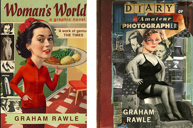
Collage requires a certain amount of compromise: you have to work with whatever is available, but for me, this constraint has always produced interesting results because it forces me to become more inventive. I also found that the text pieces, however short, carried with them something of their original context and that the tone and flavour came through clearly in the finished piece. The card was only a couple of hundred words, but it got me thinking about the possibility of constructing a whole novel in this way, and that led to Woman’s World.
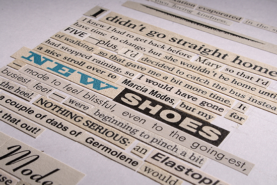
I spent five years creating Woman’s World, a full-length novel constructed by piecing together fragments of text clipped from early 1960s women’s magazines. My main concern was to ensure that the collage method was relevant to the story – the form and content considered as one.
I had been writing a story about a housebound and somewhat troubled woman, Norma, whose life is governed by the ideals prescribed by the women’s magazines she devours. Their strong directives leave no room for compromise, making it hard for any ordinary woman, let alone Norma, to live up to their demands.
The shortfall leads her to create a persona entirely fabricated from the words in the magazines. When it occurred to me that Norma could actually be a cross-dressing man, the whole thing made perfect sense. Women’s weeklies from that period actually read like a ‘how to’ instructional manual for the budding transvestite – everything you need to know to achieve perfection in all areas of womanliness. The very idea of Norma sitting down with scissors and glue, cutting bits from her beloved magazines and pasting them together to tell her story already says a great deal about her fragmented mind and her dependence on the magazines to find her female voice.
Having established the look of the narrative voice, I needed to ensure as comfortable a reading experience as possible. I designed a simple formal type grid, which runs throughout the book. I occasionally break through its parameters in order to visually underscore the dramatic tension in a particular scene. The book design, the layout of the page must be governed by the story content. I’m not interested in adding visual tricks unless they’re inextricably linked to the story and add something to it.
Each book I write has a different look because each character’s story is different. My most recently published book, The Card, is about a man who collects cards he finds on the street – each one apparently containing a hidden clue to a coded message instructing him to save the life of Princess Diana. As he embarks on his mission, a parallel narrative strand from thirty years earlier gradually reveals the underlying motive for his obsession. The two narrative paths begin to converge as the story heads towards its seemingly preordained conclusion.
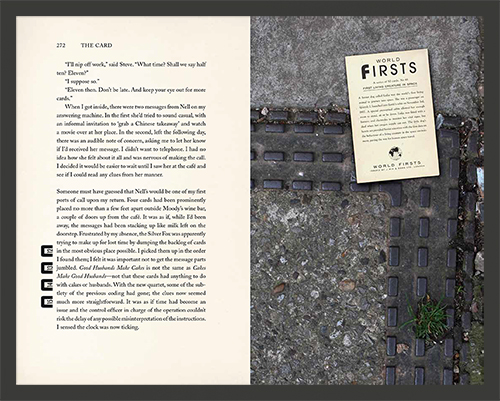
Riley is obsessive, but he’s quite ordered in his thinking so this is reflected in my page design. The text makes use of varying fonts and a series of coded graphic symbols to register connections and highlight coincidences throughout the story. Again, these visual signifiers provide an unwritten subtext that aims to give insight into the workings of the protagonist’s mind and his unique view of the world.
"I’m not interested in adding visual tricks unless they’re inextricably linked to the story and add something to it."
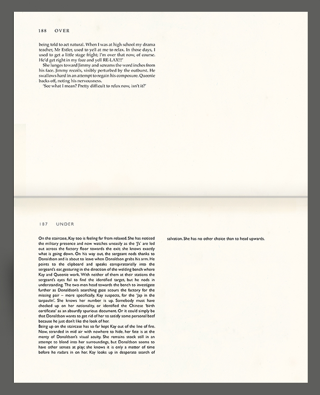
The book I’m working on now, Overland, to be published next year, is, at the moment, straight text. It’s early days yet, but because the story is themed around a kind of heaven and hell, existing one above the other, I’ve been experimenting with using the gutter to delineate between the two worlds, with twin narratives running in the direction of the spine, above and below it. So the reader would open the book hinging horizontally more like a laptop (or the old style policeman’s notebook). It’s such a simple idea to have a horizontal spine rather than vertical and it’s puzzling that in hundreds of years hardly any fiction writers, publishers or printers have ever considered it. Maybe it’s time to take a sideways look at things.
Graham Rawle April 2014
